2025 — STRIVER (AUSTRALIA 🇦🇺)
Increased Retention by Simplifying Filter Experience
PLATFORM
Website & Mobile
TIMELINE
2025
ROLE
UI/UX Designer
2025 — STRIVER (AUSTRALIA 🇦🇺)
Increased Retention by Simplifying Filter Experience
PLATFORM
Website & Mobile
TIMELINE
2025
ROLE
UI/UX Designer
2025 — STRIVER (AUSTRALIA 🇦🇺)
Increased Retention by Simplifying Filter Experience
PLATFORM
Website & Mobile
TIMELINE
2025
ROLE
UI/UX Designer
Striver is a fintech-focused hiring platform that connects financial services firms with top-tier, vetted candidates. From wealth management firms to fintech startups, companies can discover talent aligned with their business goals.
Striver is a fintech-focused hiring platform that connects financial services firms with top-tier, vetted candidates. From wealth management firms to fintech startups, companies can discover talent aligned with their business goals.
Background
Background
Background
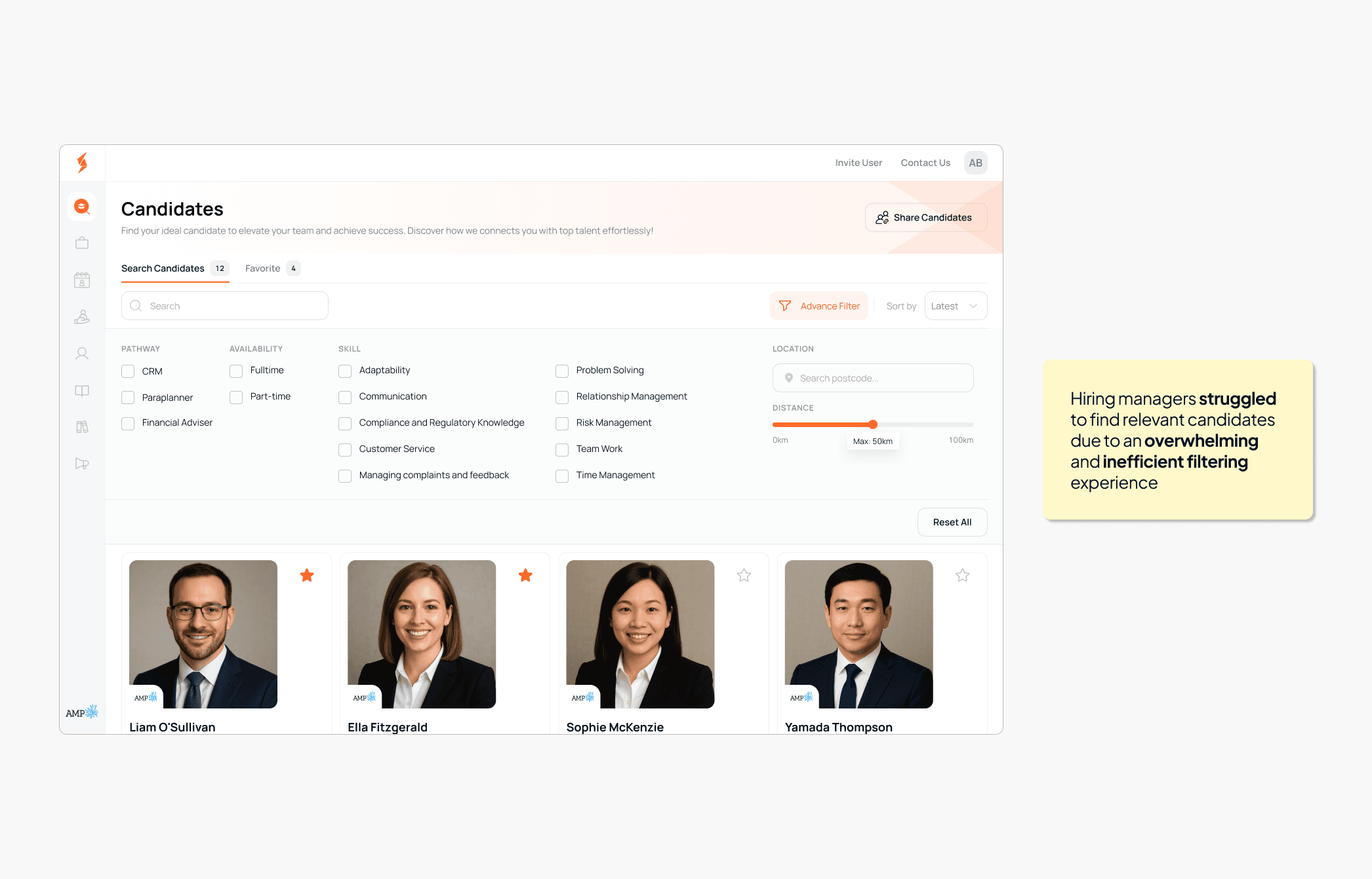
Our team identified a core problem: hiring managers were struggling to find relevant candidates due to an overwhelming and inefficient filtering experience. This became especially critical as Striver scaled its marketplace and onboarded more talent in the financial services sector.
We were brought in to redesign the filter panel experience. Our goal was to reduce friction, improve clarity, and ultimately help clients find the right candidates more efficiently.
My Role
My Role
My Role
As the Product Designer on this project, I collaborated closely with the Product Manager and a Frontend Engineer. I was responsible for the entire UX process: problem validation, ideation, wireframing, prototyping, and working with devs to ensure seamless handoff and QA during implementation.
As the Product Designer on this project, I collaborated closely with the Product Manager and a Frontend Engineer. I was responsible for the entire UX process: problem validation, ideation, wireframing, prototyping, and working with devs to ensure seamless handoff and QA during implementation.
User Problems
User Problems
The original filter experience was laid out horizontally across the top of the page, just above the candidate cards. While it looked clean, it suffered from multiple UX issues:
The original filter experience was laid out horizontally across the top of the page, just above the candidate cards. While it looked clean, it suffered from multiple UX issues:
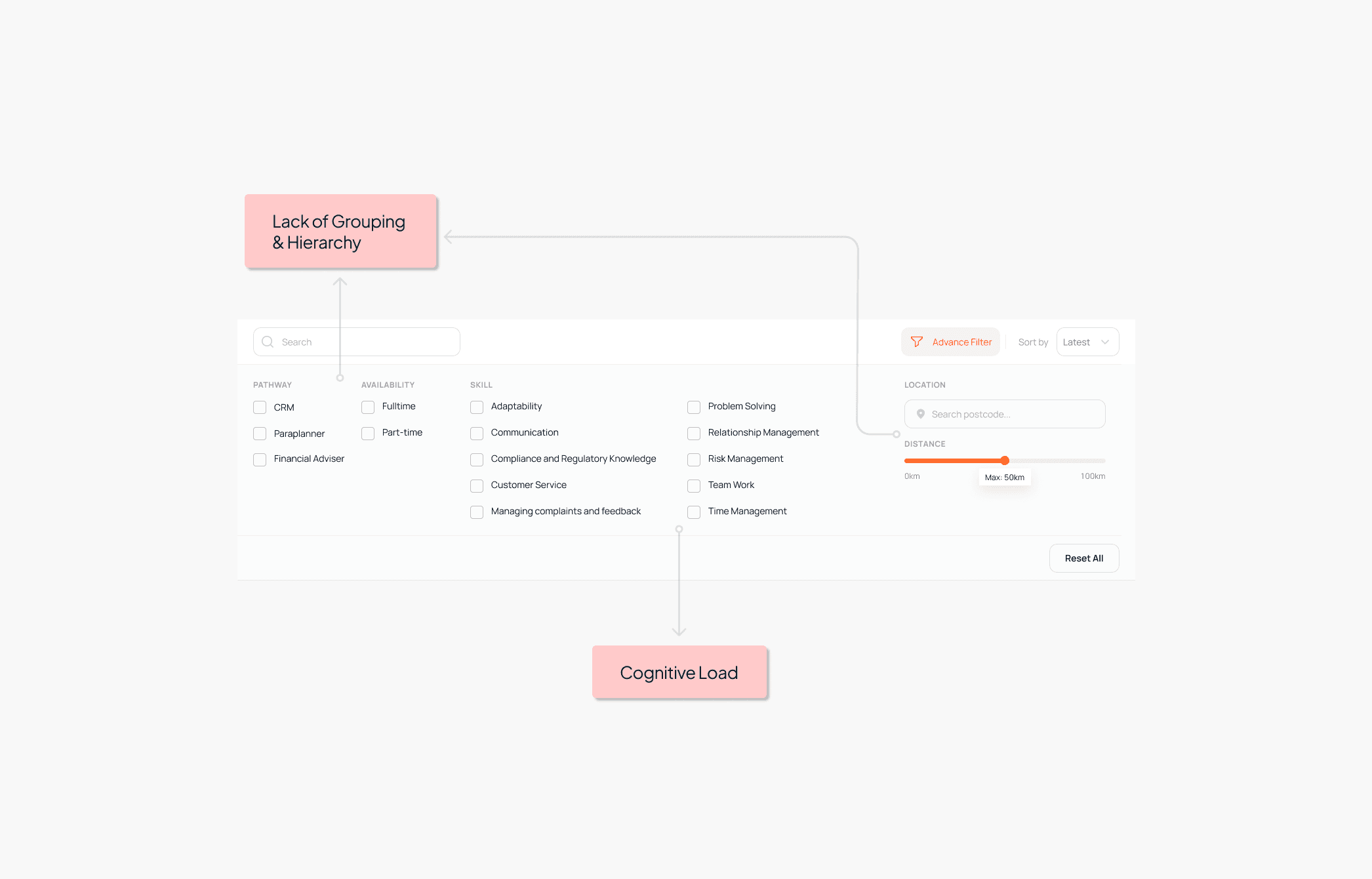
Low Visibility & Cognitive Load
Filters like “Skills” had up to 10 checkboxes but were presented in a long, dense row. Important filters such as “Location” and “Distance” were pushed to the far right and often missed entirely (especially on smaller screens)Lack of Grouping & Hierarchy
There was no clear separation between filter categories like Pathway, Availability, and Skills. They all visually blended together, making it harder for users to scan or prioritize what to select.Reduced Engagement
In our analysis, 67% of sessions with search activity did not involve any filter usage. Many users simply scrolled through results or gave up after a few cards. Interviews revealed they didn’t notice the filters were customizable or felt unsure what each filter meant.
" We couldn't quickly find the right fit. The filters felt more like a blocker than a tool" — Feedback from a client in a usability session
" We couldn't quickly find the right fit. The filters felt more like a blocker than a tool" — Feedback from a client in a usability session
Goals
Goals
We had two core goals for this redesign:
We had two core goals for this redesign:
Increase engagement with filters
More recruiters should actively use them.Improve result relevance
Reduce mismatches and improve satisfaction with candidate results.
Increase engagement with filters
More recruiters should actively use them.Improve result relevance
Reduce mismatches and improve satisfaction with candidate results.
Discovery & Direction
Discovery & Direction
1. Heuristic Review & Analytics
1. Heuristic Review & Analytics
1. Heuristic Review & Analytics
We began by combining quantitative data (filter click rates, scroll heatmaps) and qualitative data (user interviews and support tickets). A few takeaways:
We began by combining quantitative data (filter click rates, scroll heatmaps) and qualitative data (user interviews and support tickets). A few takeaways:
• Users overlooked the filter bar because it blended into the top navigation.
• Users overlooked the filter bar because it blended into the top navigation.
• Some weren’t aware that filters could be used in combination.
• Some weren’t aware that filters could be used in combination.
• The horizontal layout made it difficult to glance at multiple options at once.
• The horizontal layout made it difficult to glance at multiple options at once.
2. Exploring New Concepts
2. Exploring New Concepts
2. Exploring New Concepts
We explored two directions:
(A) keep filters horizontal but improve visibility and grouping,
(B) move filters to a left-side vertical layout.
Both had trade-offs. Option A kept the layout compact, but still constrained space. Option B allowed for better scannability and grouping (ultimately became the direction we chose after testing)
Solution
Solution
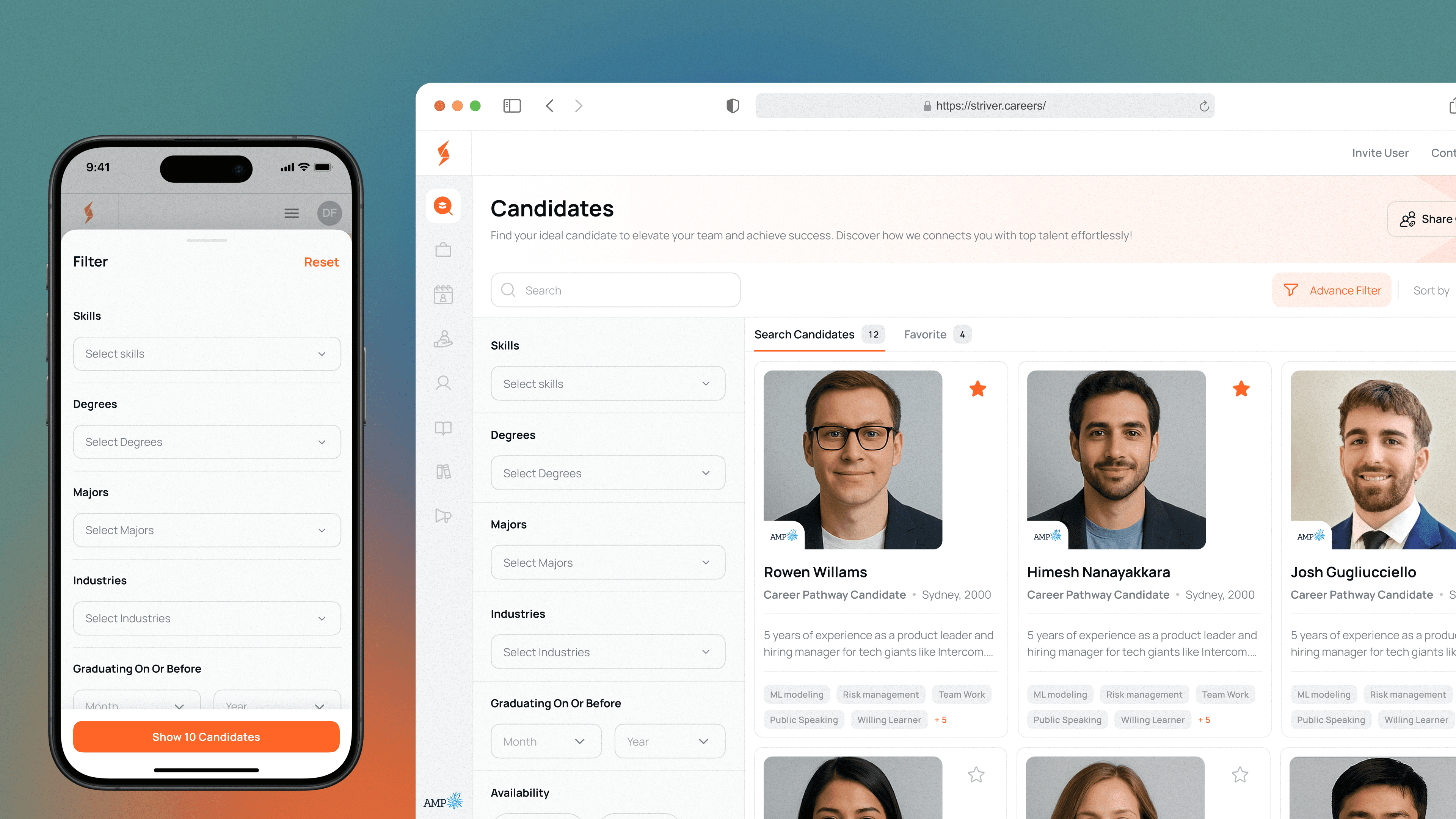
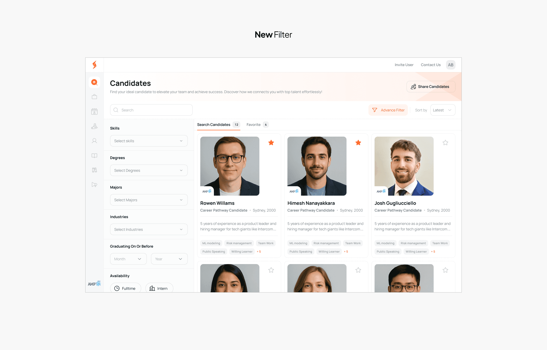
We redesigned the entire filter system with a vertical sidebar layout, placed prominently on the left side of the candidate list page.
We redesigned the entire filter system with a vertical sidebar layout, placed prominently on the left side of the candidate list page.
Key improvements:
Key improvements:
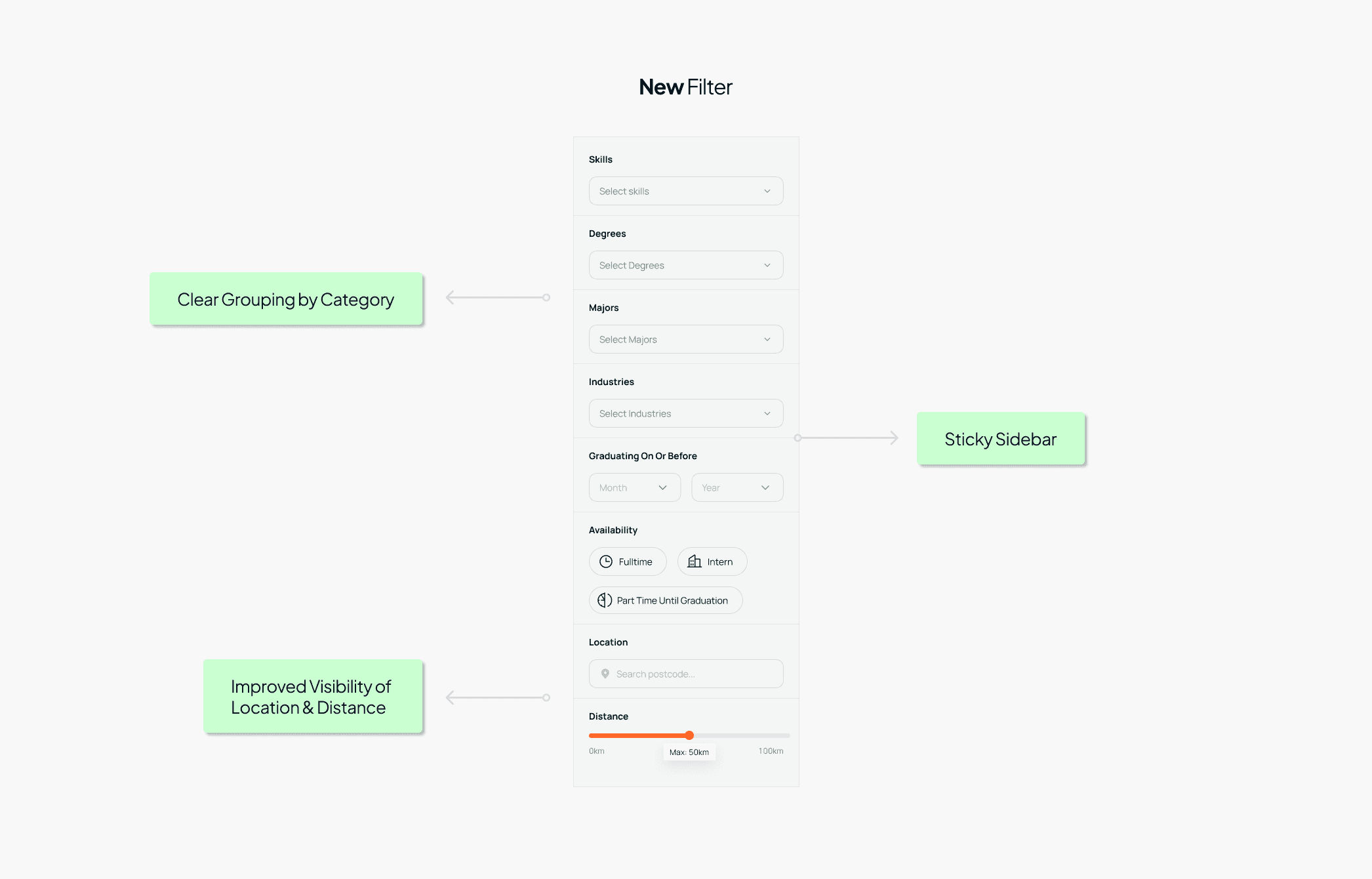
Clear Grouping by Category
Filters are now grouped under clear labels like Skills, Degrees, Majors, Industries, Availability, & Location. This makes it easier to understand what each filter does and how it contributes to narrowing results.Improved Visibility of Location & Distance
We added a dedicated section for Location input and a distance slider, helping recruiters find nearby candidates more effectively. These were previously hidden far off to the right.Sticky Sidebar UX
The entire filter component is sticky and scrolls independently, so users can modify filters as they browse candidate cards.Visual Feedback
When filters are applied, a subtle orange highlight shows active states, and the “Reset All” button becomes prominent (encouraging exploration without fear of getting lost)Mobile Responsiveness
To optimize the mobile experience, I implemented the filter as a bottom sheet instead of a full-screen modal. This approach lets users keep visual context of the main screen, reduces cognitive load, supports one-handed use, and aligns with common mobile patterns, making the filtering process feel more intuitive and less disruptive.
Iteration, Validation, and Testing
Iteration, Validation, and Testing
We didn’t land on the final design overnight, it took multiple rounds of iteration backed by direct feedback and real usage data. Early concepts were shared with internal stakeholders and actual recruiters via Figma prototypes and unmoderated tests.
We didn’t land on the final design overnight, it took multiple rounds of iteration backed by direct feedback and real usage data. Early concepts were shared with internal stakeholders and actual recruiters via Figma prototypes and unmoderated tests.
What we did:
What we did:
Low-Fidelity Wireframe Testing
Initial sketches explored both horizontal and vertical filter layouts. We ran quick tests using Maze and internal stakeholder reviews to see which version users noticed and understood faster. The vertical layout consistently won in clarity and speed of comprehension.High-Fidelity Prototype Interviews
We conducted 1:1 interviews with recruiters using clickable prototypes. Many users commented that grouping filters by category made the experience “less overwhelming” and “more strategic.”Live A/B Testing
Before fully rolling out the redesign, we launched it to a limited group of users. Metrics like filter interaction rate, candidate card engagement, and time-on-task were monitored. These early signals gave us confidence to proceed with a full launch.Mobile-Specific Iterations
On mobile, the vertical sidebar transformed into a bottom sheet modal. We tested it to ensure it didn’t feel intrusive or buried. The full-screen bottom sheet version made it easier to focus, especially for filters with long option lists like Skills.
Each round of testing helped us eliminate friction, fine-tune copy, and validate that the design worked across all use cases.
Each round of testing helped us eliminate friction, fine-tune copy, and validate that the design worked across all use cases.
The redesigned filter experience brought meaningful changes in how recruiters engaged with the platform. While we can’t disclose exact numbers due to NDA, internal analytics and user feedback confirmed a strong lift in engagement and retention. Recruiters were more willing to explore candidates, use advanced filtering, and return to the platform for repeat hiring.
The redesigned filter experience brought meaningful changes in how recruiters engaged with the platform. While we can’t disclose exact numbers due to NDA, internal analytics and user feedback confirmed a strong lift in engagement and retention. Recruiters were more willing to explore candidates, use advanced filtering, and return to the platform for repeat hiring.
What changed?
What changed?
What changed?
• Increased Filter Engagement
Recruiters showed more confidence using filters, especially after we clarified copy and restructured the layout. “Location” became one of the most-used filters after the redesign.
• Increased Filter Engagement
Recruiters showed more confidence using filters, especially after we clarified copy and restructured the layout. “Location” became one of the most-used filters after the redesign.
• Lower Drop-off Rates
Users were more likely to continue browsing candidate cards, instead of exiting after the first few scrolls. Indicating better alignment between filter results and user expectations.
• Lower Drop-off Rates
Users were more likely to continue browsing candidate cards, instead of exiting after the first few scrolls. Indicating better alignment between filter results and user expectations.
• Boosted Retention
The more intuitive filter system encouraged recruiters to return, especially when looking for niche or specific roles, showing the long-term value of UX-centered improvements 🙂
• Boosted Retention
The more intuitive filter system encouraged recruiters to return, especially when looking for niche or specific roles, showing the long-term value of UX-centered improvements 🙂
Learnings
Learnings
Learnings
This project reinforced a simple but often overlooked UX truth: functionality should never be sacrificed for visual minimalism. Filters aren’t just an extra, they’re core to the product experience. I learned that:
Scannability and grouping improve confidence and usage.
“Clean” layouts can fail if they hide too much power behind extra clicks.
A mix of qualitative interviews and behavioral metrics gives a complete picture.