2024 — GOSWITCH (AUSTRALIA 🇦🇺)
Improved Conversion and Reduced Drop-off by Rethinking Discount Input Flow
PLATFORM
Website
TIMELINE
2024
ROLE
UI/UX Designer

2024 — GOSWITCH (AUSTRALIA 🇦🇺)
Improved Conversion and Reduced Drop-off by Rethinking Discount Input Flow
PLATFORM
Website
TIMELINE
2024
ROLE
UI/UX Designer
2024 — GOSWITCH (AUSTRALIA 🇦🇺)
Improved Conversion and Reduced Drop-off by Rethinking Discount Input Flow
PLATFORM
Website
TIMELINE
2024
ROLE
UI/UX Designer
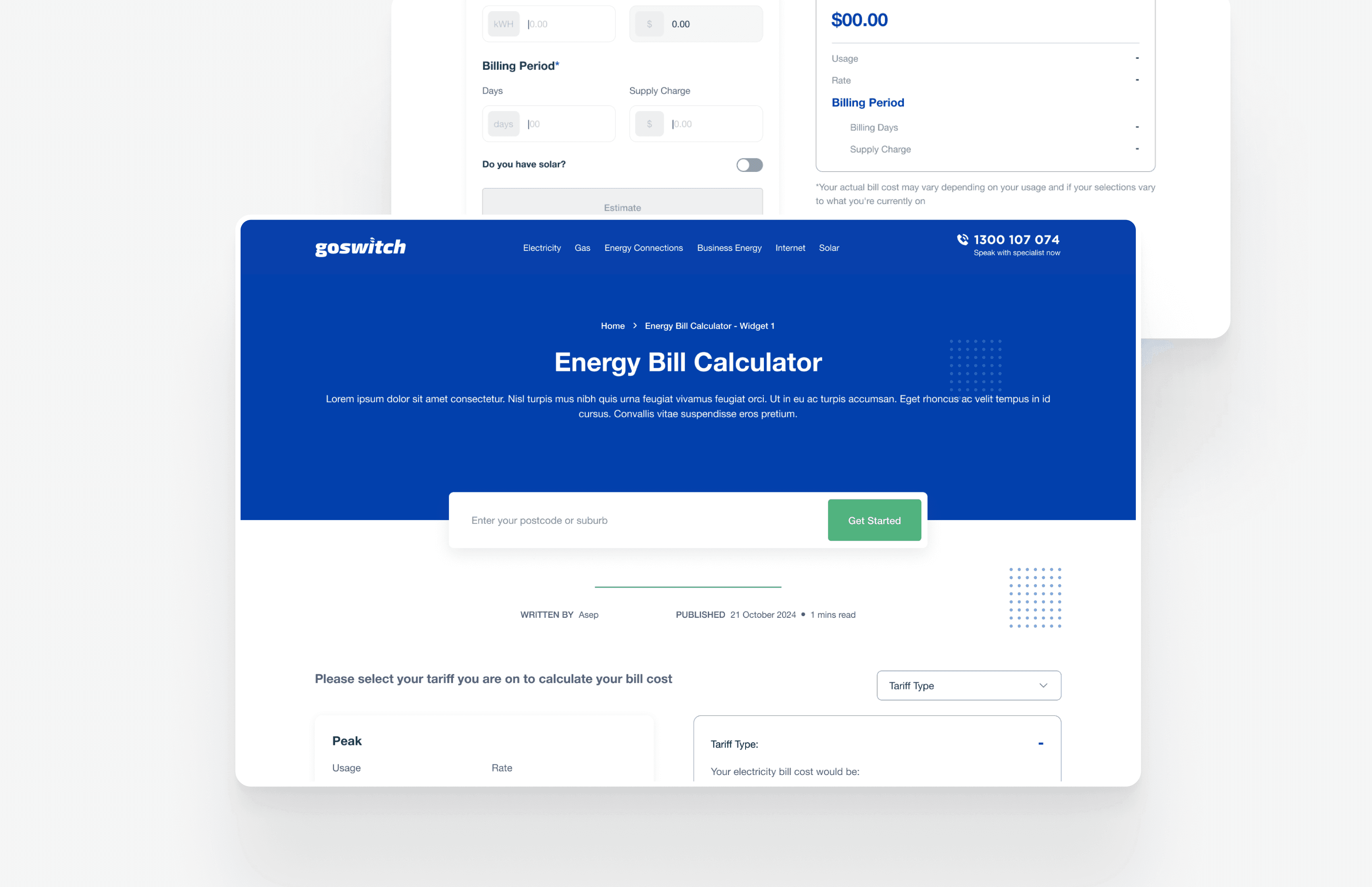
In this project, I delivered the UI design for a new Energy Bill Calculator experience that empowers users to calculate energy costs with discounts based on their specific tariff type. Working closely with product managers, we crafted a user flow that simplifies comparisons and clarified complex tariff structures. This action helped users make smarter and faster decisions.
In this project, I delivered the UI design for a new Energy Bill Calculator experience that empowers users to calculate energy costs with discounts based on their specific tariff type. Working closely with product managers, we crafted a user flow that simplifies comparisons and clarified complex tariff structures. This action helped users make smarter and faster decisions.
User Problems
User Problems
When reviewing the performance of our old Energy Bill Calculator, we discovered several usability issues that affected completion rates and overall user satisfaction.
We began with a combination of session recordings, user feedback, and support ticket analysis to identify friction points. From these, we mapped out common failure patterns that prevented users from successfully estimating their energy costs.
Behavioral & Qualitative Findings
Behavioral & Qualitative Findings
Behavioral & Qualitative Findings
Confusing Discount Input Flow
Users were unsure where and how to enter discounts. Many misunderstood whether they should apply discounts to usage, supply charges, or both (this causing incorrect results or drop-offs).Unclear Flow for Solar Users
Users with solar panels reported confusion about entering their export values and understanding Feed-in Tariff calculations. The interface didn’t distinguish between general users and solar users, resulting in mismatched expectations.Overwhelming Layout
The original layout included dense input fields with inconsistent naming conventions (e.g., mixing units and unclear field labels), making the tool feel technical and intimidating, especially for non-expert users.
Insights
Insights
Insights
Our research found that users often struggled to complete the Energy Bill Calculator due to confusing input flows and unclear terminology. Many users didn’t know where or how to apply discounts, especially when deciding between usage or supply charges. Solar users also faced challenges, as the calculator didn’t clearly support scenarios like exports or Feed-in Tariffs. These pain points created friction and caused users to drop off before finishing their calculations. Session recordings showed that many users abandoned the process early. These insights highlighted the need for a simpler structure, better clarity, have first approach to boost completion and user satisfaction.
Our research found that users often struggled to complete the Energy Bill Calculator due to confusing input flows and unclear terminology. Many users didn’t know where or how to apply discounts, especially when deciding between usage or supply charges. Solar users also faced challenges, as the calculator didn’t clearly support scenarios like exports or Feed-in Tariffs. These pain points created friction and caused users to drop off before finishing their calculations. Session recordings showed that many users abandoned the process early. These insights highlighted the need for a simpler structure, better clarity, have first approach to boost completion and user satisfaction.
Based on these challenges, we concluded that users needed:
• Clearer input structure with progressive disclosure, only showing relevant fields.
• Simplified discount mechanism with guided inputs.
• Dedicated flow for solar vs non-solar users.
Based on these challenges, we concluded that users needed:
• Clearer input structure with progressive disclosure, only showing relevant fields.
• Simplified discount mechanism with guided inputs.
• Dedicated flow for solar vs non-solar users.
UX Audit Findings
UX Audit Findings
We started by observing how users interacted with the old Energy Bill Calculator and where they gave up. Through recordings, support tickets, and form analytics, a clear pattern emerged: users weren’t just confused, they were overwhelmed.
We started by observing how users interacted with the old Energy Bill Calculator and where they gave up. Through recordings, support tickets, and form analytics, a clear pattern emerged: users weren’t just confused, they were overwhelmed.
Confusing Discount Flow
Users didn’t understand where or how to apply their discounts. Some tried entering a single value across all tariffs. Others missed the input altogether. The UI offered no guidance or guardrails.No Path for Solar Users
Those with solar panels couldn’t figure out how to input export data. Feed-in Tariff fields were either missing or buried. The calculator treated solar and non-solar users the same, despite drastically different needs.Dense Layout, Technical Language
Input fields were stacked vertically with minimal grouping. Labels like “Supply Charge (Daily)” or “kWh Usage Tier 2” confused casual users. Units were mixed in-some auto-filled, others blank. It's breaking rhythm and trust.
Iteration & Solution
Iteration & Solution
A More Guided Discount Input
A More Guided Discount Input
A More Guided Discount Input
We introduced a two-step input for discounts. First, users choose where their discount applies: usage, supply, or both. Only then do we reveal the corresponding fields and no more cognitive overload. Inputs are pre-labeled and auto-calculate totals in real-time, reducing ambiguity.
We introduced a two-step input for discounts. First, users choose where their discount applies: usage, supply, or both. Only then do we reveal the corresponding fields and no more cognitive overload. Inputs are pre-labeled and auto-calculate totals in real-time, reducing ambiguity.
"Instead of showing all inputs at once, the calculator now responds to the user's selection"
"Instead of showing all inputs at once, the calculator now responds to the user's selection"
"Instead of showing all inputs at once, the calculator now responds to the user's selection"
"Instead of showing all inputs at once, the calculator now responds to the user's selection"
A Dedicated Solar Flow
A Dedicated Solar Flow
A Dedicated Solar Flow
During onboarding, users indicate whether they have solar. If they do, a contextual block appears with fields for export values and Feed-in Tariff rates. Non-solar users skip this entirely. This split flow ensures each user type sees only what matters to them.
During onboarding, users indicate whether they have solar. If they do, a contextual block appears with fields for export values and Feed-in Tariff rates. Non-solar users skip this entirely. This split flow ensures each user type sees only what matters to them.
"Solar users now feel acknowledged and guided rather than left to figure it out themselves"
"Solar users now feel acknowledged and guided rather than left to figure it out themselves"
"Solar users now feel acknowledged and guided rather than left to figure it out themselves"
"Solar users now feel acknowledged and guided rather than left to figure it out themselves"
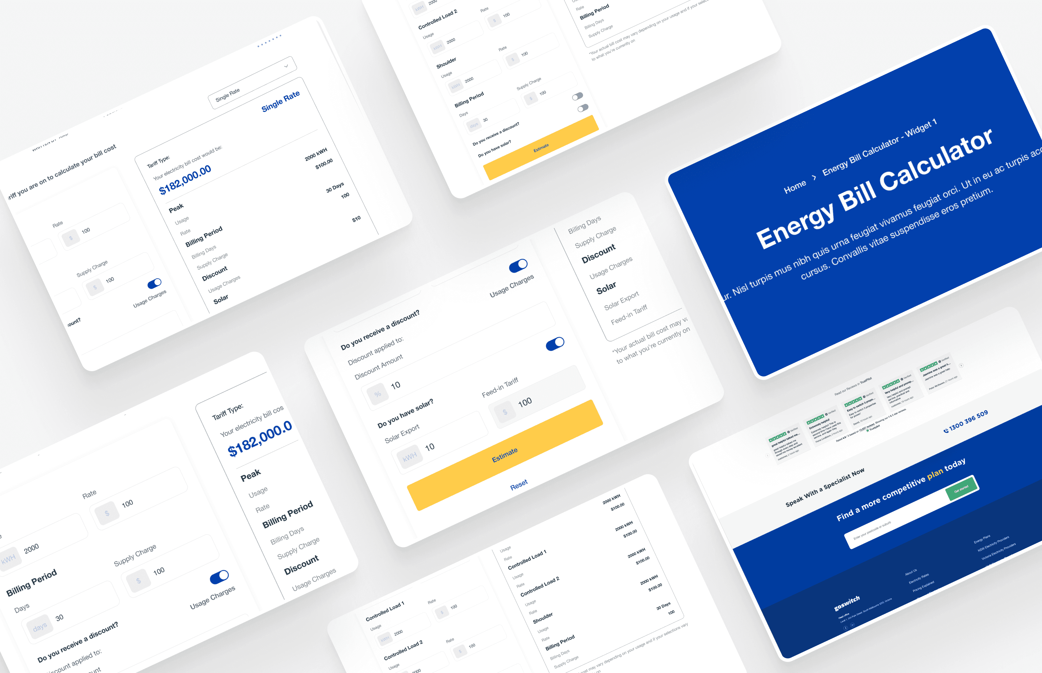
Progressive Disclosure for Field Inputs
Progressive Disclosure for Field Inputs
Progressive Disclosure for Field Inputs
Inputs are now organized into expandable sections:
• Usage Charges
• Supply Charges
• Discounts
• Solar (if applicable)
Each section is collapsible. On desktop, they sit side-by-side for comparison. On mobile, they collapse after completion, maintaining momentum and minimizing fatigue.
Inputs are now organized into expandable sections:
• Usage Charges
• Supply Charges
• Discounts
• Solar (if applicable)
Each section is collapsible. On desktop, they sit side-by-side for comparison. On mobile, they collapse after completion, maintaining momentum and minimizing fatigue.
Simplified Language, Standardized Units
Simplified Language, Standardized Units
Every field now includes helper text and aligned units. We replaced terms like “Tier 1 Usage” with plain language like “First 1000 kWh.” Tooltips explain terms on hover or tap, demystifying energy jargon for everyday users.
Every field now includes helper text and aligned units. We replaced terms like “Tier 1 Usage” with plain language like “First 1000 kWh.” Tooltips explain terms on hover or tap, demystifying energy jargon for everyday users.
Testing & Validation
Testing & Validation
We ran a series of moderated usability sessions with 6 target users: 3 solar users, 3 general energy consumers. Tasks included calculating bills with discounts and exporting solar values. Success was measured by task completion time and confidence scores.
To complement the qualitative insights, we also launched a 50/50 A/B test of the new calculator. We tracked bounce rate, time on page, and completion rates over a two-week period using internal analytics tools.
Two weeks after launch, usage data confirmed what we’d seen in testing: the redesign worked well. The improved flow not only boosted completion but also reduced friction across the user journey.
Two weeks after launch, usage data confirmed what we’d seen in testing: the redesign worked well. The improved flow not only boosted completion but also reduced friction across the user journey.
Completion rate rose from 52.8% to 75.2%
A significant increase in task completion indicated that users now understood what to do and felt more confident filling in the calculator. The redesign lowered cognitive effort and reduced hesitation caused by unclear input structures.Bounce rate on mobile dropped by 34%
Users with solar panels reported confusion about entering their export values and understanding Feed-in Tariff calculations. The interface didn’t distinguish between general users and solar users, resulting in mismatched expectations.Support tickets tagged with “bill calculator” dropped by half
A clear sign that fewer users were getting stuck. Questions around where to input solar values or how discounts worked all but disappeared, freeing up time for the support team to focus on higher-level issues.