2023 — SRIBU
Sribu.com Redesign: Merged Two Brands, Boosted Engagement
PLATFORM
Responsive Website
TIMELINE
January 2023 — July 2024
ROLE
UI/UX Designer
2023 — SRIBU
Sribu.com Redesign: Merged Two Brands, Boosted Engagement
PLATFORM
Responsive Website
TIMELINE
January 2023 — July 2024
ROLE
UI/UX Designer
2023 — SRIBU
Sribu.com Redesign: Merged Two Brands, Boosted Engagement
PLATFORM
Responsive Website
TIMELINE
January 2023 — July 2024
ROLE
UI/UX Designer
Context
Making freelance services easy to use
Making freelance services easy to use
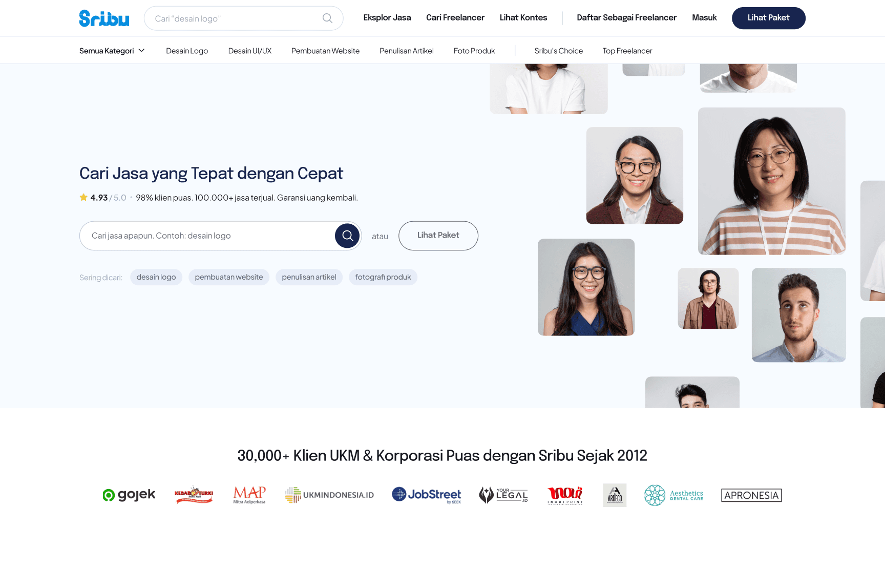
As the Sribu product team, we embarked on a major project to unify two of our core platforms (Sribu and Sribulancer) into a single, seamless experience. Sribu specialized in crowdsourced design contests, while Sribulancer enabled direct freelance hiring across various categories. The goal was to streamline the user journey, eliminate confusion between platforms, and present a cohesive brand. This redesign focused on modernizing the landing page’s visual and UX design to reduce clutter, enhance navigation, and better support small businesses, entrepreneurs, and startups in finding the right creative and professional talent.
As the Sribu product team, we embarked on a major project to unify two of our core platforms (Sribu and Sribulancer) into a single, seamless experience. Sribu specialized in crowdsourced design contests, while Sribulancer enabled direct freelance hiring across various categories. The goal was to streamline the user journey, eliminate confusion between platforms, and present a cohesive brand. This redesign focused on modernizing the landing page’s visual and UX design to reduce clutter, enhance navigation, and better support small businesses, entrepreneurs, and startups in finding the right creative and professional talent.
Sribu Before Redesign
Sribu Before Redesign
Sribulancer Before Redesign
Sribulancer Before Redesign
Objectives
* Modernize the Visual Design: Adopted a clean, minimalistic look to give a more professional and welcoming appearance.
* Enhance Usability: Simplified navigation and layout to make information more accessible and intuitive for new and returning users.
* Optimize for Responsiveness: Ensured the website is fully responsive across all devices, including desktops, tablets, and mobile phones, to accommodate various user access points.
Design Process
1. User Research & Evaluation
I began by conducting user research to identify key pain points in the current design. Through interviews and analytics, I pinpointed issues like difficulty in finding services and a lack of visual appeal. These insights guided the redesign process.
2. Wireframing & Prototyping
Created low-fidelity wireframes to map out the new layout. The focus was on simplifying the structure, making the search and category navigation prominent, and decluttering the home page.
3. UI Design & Consistency
Developed a consistent and refined visual style with a new color scheme and typography to enhance readability and aesthetics. Emphasized whitespace and visual hierarchy to ensure a clean look and better user flow.
4. High-Fidelity Design & Testing
Designed high-fidelity mockups and conducted usability testing with select users to ensure the changes effectively addressed the pain points. Feedback was gathered to make final adjustments.
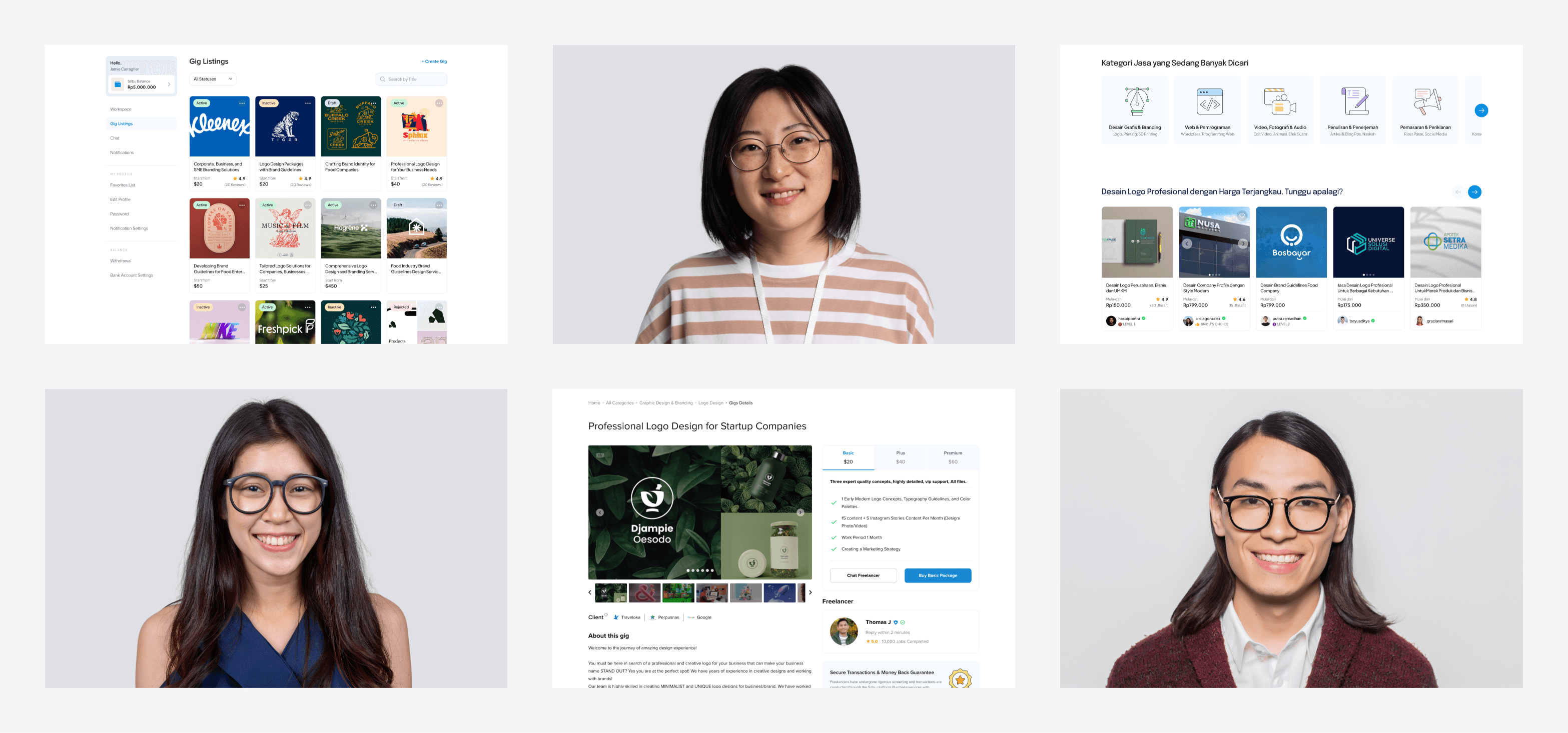
New Design System
New Design System
After Redesign
After Redesign
Result